Appearance
19 Red Color Palettes
Explore 19 expertly curated red color palettes, featuring diverse thematic schemes including healthcare, Chinese style, retro, and minimalist designs. A comprehensive color inspiration library for UI design, branding, and development projects.
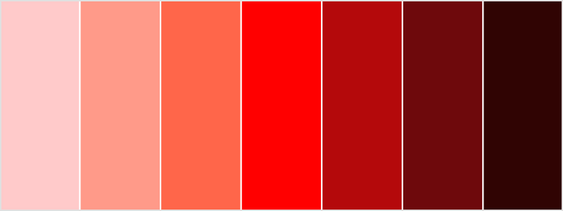
Curated Red Color Palettes
Browse 19 handpicked red color palettes for various themes and applications, from healthcare to traditional Chinese style.
Healthcare Red
Professional red color scheme for the healthcare industry
Medical Red
#B22222
Pure White
#FFFFFF
Lavender White
#E6E6FA
Pale Green
#98FB98
Steel Blue
#4682B4
Natural Organic Red
Inspired by natural reds from earth, rocks, and plants
Earth Red-Brown
#8B4513
Terracotta Red
#A0522D
Indian Red
#CD5C5C
Natural Linen
#DEB887
Beige White
#F5F5DC
Minimalist Red
Maximum effect with minimum colors - a minimalist red scheme
Primary Red
#D32F2F
Pure White
#FFFFFF
Dark Gray
#212121
Medium Gray
#757575
Light Gray
#F5F5F5
Chinese Style Red
Traditional Chinese red color scheme with cultural heritage
Cinnabar Red
#9C1A1C
Palace Wall Red
#C03B2F
Festive Red
#E84C3D
Light Concubine
#F6C9B9
Mysterious Black
#2C2C2C
Velvet Texture Red
Simulates velvet texture, from deep wine red to light pink velvet
Deep Wine Red
#6D071A
Burgundy Red
#9D2235
Velvet Red
#C44569
Light Pink
#E6A4B4
Velvet Pink
#F8E1E7
Retro Red
Vintage red scheme influenced by mid-century modernism
Ocher Red
#B5651D
Flame Orange-Red
#E25822
Olive Green
#8A9A5B
Beige
#D4B483
Charcoal Gray
#3A3A38
Monochromatic Red
Same hue with different brightness/saturation variations, gradient from white to black
Light Pink
#FFEBEE
Light Red
#EF9A9A
Primary Red
#E53935
Dark Red
#B71C1C
Deep Red
#7F0000
Red-Blue Complementary
Strong contrast between red and blue, creating visual impact
Primary Red
#E53935
Deep Blue
#1565C0
Light Blue
#BBDEFB
Light Gray
#F5F5F5
Dark Gray
#212121
Red-Orange-Yellow Analogous
Warm gradient of adjacent colors, creating energy and vitality
Red
#D32F2F
Orange
#F57C00
Yellow
#FFB300
Light Beige
#FFF8E1
Dark Brown
#5D4037
Red-Green Split Complementary
Red paired with two shades of green, creating natural balance
Primary Red
#C62828
Green
#388E3C
Light Green
#7CB342
White
#F5F5F5
Dark Gray
#424242
Red-Purple-Pink Analogous
Adjacent red, purple, and pink creating a romantic feminine palette
Rose Red
#D81B60
Purple
#8E24AA
Pink
#F06292
Light Purple
#F3E5F5
Deep Purple
#4A148C
Brick & Terracotta
Warm earthy reds inspired by bricks, clay, and Mediterranean architecture
Dark Brick
#8B3A3A
Terracotta
#B5651D
Warm Orange
#E2725B
Sandstone
#C19A6B
Cream
#F5F5DC
Red-Black-White Classic
Timeless combination of red, black, and white for bold, graphic designs
Crimson Red
#DC143C
Jet Black
#0A0A0A
Pure White
#FFFFFF
Charcoal
#36454F
Silver Gray
#C0C0C0
Berry Tones
Rich berry-inspired reds from raspberry to cranberry shades
Cranberry
#9E1B32
Raspberry
#C51D4A
Strawberry
#C45A65
Light Berry
#E6A4B4
Berry Cream
#F8E1E7
Red-Gold Luxury
Opulent combination of red and gold for premium, luxurious branding
Ruby Red
#9B111E
Gold
#FFD700
Cream
#FFFDD0
Dark Brown
#654321
Ivory
#FFFFF0
Red-Gray Modern
Contemporary scheme combining vibrant red with sophisticated grays
Scarlet Red
#FF2400
Light Gray
#D3D3D3
Medium Gray
#808080
Charcoal
#36454F
Off White
#F8F8FF
Red-Coral Vibrant
Energetic coral reds with tropical, vibrant appeal
Coral Red
#FF7F50
Salmon Pink
#FA8072
Light Coral
#F08080
Seashell
#FFF5EE
Deep Coral
#FF6347
Red-Brown Earthy
Natural red-brown tones inspired by autumn leaves and rich soil
Rust Red
#B7410E
Copper Red
#CB6D51
Sienna
#A0522D
Tan
#D2B48C
Khaki
#F0E68C
Red-Pink Pastel
Soft pastel reds and pinks for gentle, romantic designs
Pastel Red
#FF6961
Baby Pink
#FFB6C1
Blush
#F5C9C9
Misty Rose
#FFE4E1
Pale Pink
#FADADD
Generate Red Color Palettes
Explore curated and automatically generated color palettes featuring red. See how it harmonizes with other colors for UI themes, graphics, and branding materials.
Sequential
Single hue gradient for data visualization
7 colors
Lightest
#DAF1FF
Light
#ACD2F3
Medium Light
#7AB5E7
Medium
#3498DB
Medium Dark
#2B6F9F
Dark
#214967
Darkest
#142634
Diverging
Dual hue gradient with a neutral midpoint
9 colors
Base End
#3498DB
Left Dark
#76AEE2
Left Medium
#A4C5E9
Left Light
#CEDDEF
Neutral
#F5F5F5
Right Light
#F5D5C3
Right Medium
#F1B593
Right Dark
#E89664
Complementary End
#DB7734
Monochromatic
Same hue, different brightness/saturation
5 colors
Lightest
#FFFFFF
Light
#A9CAED
Medium
#3498DB
Dark
#004D89
Darkest
#000000
Analogous
Colors adjacent on the color wheel (30° apart)
5 colors
Left Adjacent 2
#34DB77
Left Adjacent 1
#34DBCB
Main
#3498DB
Right Adjacent 1
#3445DB
Right Adjacent 2
#7734DB
Complementary
Colors opposite on the color wheel (180° apart)
2 colors
Main
#3498DB
Complementary
#DB7734
Triadic
Evenly spaced around the color wheel (120° apart)
3 colors
Main
#3498DB
Secondary
#DB3498
Tertiary
#98DB34
Square
Four colors evenly spaced (90° apart)
4 colors
Main
#3498DB
Right 90°
#CB34DB
Complementary
#DB7734
Left 90°
#45DB34
Tetradic
Two pairs of complementary colors
4 colors
Main
#3498DB
Secondary
#7734DB
Complementary
#DB7734
Complementary Secondary
#98DB34
Split Complementary
Complementary colors ±30°
3 colors
Main
#3498DB
Split Left
#DB3444
Split Right
#DBCB34
Cyclic
Circular gradient for periodic data
8 colors
0°
#3498DB
45°
#4D34DB
90°
#CB34DB
135°
#DB346E
180°
#DB7734
225°
#C2DB34
270°
#45DB34
315°
#34DBA1
Pastel
Soft, desaturated colors for modern UI
6 colors
Light Pastel
#A2B6C3
Pastel 1
#AFBFCB
Pastel 2
#BBC9D3
Pastel 3
#C7D3DB
Pastel 4
#D4DDE3
Deep Pastel
#E0E7EB
Extract Red Color Palette from Image
Upload a photo to extract a red color palette with HEX and RGB codes.
click or drag your image here
Supported formats: JPG, PNG, WebP
Red Color Code Converter
Instantly convert between HEX, RGB, CMYK, and more.
All Formats:
- HEX:#ECB12E
- RGB:rgb(236, 177, 46)
- CMYK:cmyk(0%, 25%, 81%, 7%)
- HSV:hsv(41°, 81%, 93%)
- HSL:hsl(41°, 83%, 55%)
Other Red Color Palette
Light Red Palette
Sequential
Single hue gradient for data visualization
7 colors
Lightest
#FFE6E5
Light
#FFDDDD
Medium Light
#FFD5D4
Medium
#FFCCCB
Medium Dark
#FF9D8B
Dark
#FF6A4D
Darkest
#FB1A08
Diverging
Dual hue gradient with a neutral midpoint
9 colors
Base End
#FFCCCB
Left Dark
#FDD6D5
Left Medium
#FBE1E0
Left Light
#F8EBEA
Neutral
#F5F5F5
Right Light
#EBF7F7
Right Medium
#E1FAFA
Right Dark
#D6FCFC
Complementary End
#CBFEFF
Monochromatic
Same hue, different brightness/saturation
5 colors
Lightest
#FFFFFF
Light
#FFE5E5
Medium
#FFCCCB
Dark
#865B5B
Darkest
#000000
Analogous
Colors adjacent on the color wheel (30° apart)
5 colors
Left Adjacent 2
#FFCBFE
Left Adjacent 1
#FFCBE4
Main
#FFCCCB
Right Adjacent 1
#FFE6CB
Right Adjacent 2
#FEFFCB
Complementary
Colors opposite on the color wheel (180° apart)
2 colors
Main
#FFCCCB
Complementary
#CBFEFF
Triadic
Evenly spaced around the color wheel (120° apart)
3 colors
Main
#FFCCCB
Secondary
#CBFFCC
Tertiary
#CCCBFF
Square
Four colors evenly spaced (90° apart)
4 colors
Main
#FFCCCB
Right 90°
#E4FFCB
Complementary
#CBFEFF
Left 90°
#E6CBFF
Tetradic
Two pairs of complementary colors
4 colors
Main
#FFCCCB
Secondary
#FEFFCB
Complementary
#CBFEFF
Complementary Secondary
#CCCBFF
Split Complementary
Complementary colors ±30°
3 colors
Main
#FFCCCB
Split Left
#CBFFE6
Split Right
#CBE4FF
Cyclic
Circular gradient for periodic data
8 colors
0°
#FFCCCB
45°
#FFF3CB
90°
#E4FFCB
135°
#CBFFD9
180°
#CBFEFF
225°
#CBD7FF
270°
#E6CBFF
315°
#FFCBF1
Pastel
Soft, desaturated colors for modern UI
6 colors
Light Pastel
#C99C9C
Pastel 1
#D1AAA9
Pastel 2
#D8B7B6
Pastel 3
#DFC4C3
Pastel 4
#E6D1D1
Deep Pastel
#EDDEDE
Dark Red Palette
Sequential
Single hue gradient for data visualization
7 colors
Lightest
#FF5355
Light
#D73A39
Medium Light
#B1211E
Medium
#8B0000
Medium Dark
#660602
Dark
#430702
Darkest
#250000
Diverging
Dual hue gradient with a neutral midpoint
9 colors
Base End
#8B0000
Left Dark
#AE4D39
Left Medium
#CC8573
Left Light
#E4BCB2
Neutral
#F5F5F5
Right Light
#C3DAD9
Right Medium
#91C0BF
Right Dark
#5CA5A4
Complementary End
#008B8B
Monochromatic
Same hue, different brightness/saturation
5 colors
Lightest
#FFFFFF
Light
#D18978
Medium
#8B0000
Dark
#630000
Darkest
#000000
Analogous
Colors adjacent on the color wheel (30° apart)
5 colors
Left Adjacent 2
#8B008B
Left Adjacent 1
#8B0046
Main
#8B0000
Right Adjacent 1
#8B4600
Right Adjacent 2
#8B8B00
Complementary
Colors opposite on the color wheel (180° apart)
2 colors
Main
#8B0000
Complementary
#008B8B
Triadic
Evenly spaced around the color wheel (120° apart)
3 colors
Main
#8B0000
Secondary
#008B00
Tertiary
#00008B
Square
Four colors evenly spaced (90° apart)
4 colors
Main
#8B0000
Right 90°
#468B00
Complementary
#008B8B
Left 90°
#45008B
Tetradic
Two pairs of complementary colors
4 colors
Main
#8B0000
Secondary
#8B8B00
Complementary
#008B8B
Complementary Secondary
#00008B
Split Complementary
Complementary colors ±30°
3 colors
Main
#8B0000
Split Left
#008B46
Split Right
#00458B
Cyclic
Circular gradient for periodic data
8 colors
0°
#8B0000
45°
#8B6800
90°
#468B00
135°
#008B23
180°
#008B8B
225°
#00238B
270°
#45008B
315°
#8B0068
Pastel
Soft, desaturated colors for modern UI
6 colors
Light Pastel
#C99C9C
Pastel 1
#D1A9A9
Pastel 2
#D8B6B6
Pastel 3
#DFC3C3
Pastel 4
#E6D1D1
Deep Pastel
#EDDEDE
Wine Red Palette
Sequential
Single hue gradient for data visualization
7 colors
Lightest
#DB969E
Light
#B7727A
Medium Light
#945057
Medium
#722F37
Medium Dark
#4E2428
Dark
#2D191B
Darkest
#0A0A0A
Diverging
Dual hue gradient with a neutral midpoint
9 colors
Base End
#722F37
Left Dark
#955E62
Left Medium
#B68E90
Left Light
#D6C1C1
Neutral
#F5F5F5
Right Light
#C3D3D0
Right Medium
#93B2AD
Right Dark
#63918B
Complementary End
#2F726A
Monochromatic
Same hue, different brightness/saturation
5 colors
Lightest
#FFFFFF
Light
#BB9394
Medium
#722F37
Dark
#4C0B19
Darkest
#000000
Analogous
Colors adjacent on the color wheel (30° apart)
5 colors
Left Adjacent 2
#6A2F72
Left Adjacent 1
#722F58
Main
#722F37
Right Adjacent 1
#72482F
Right Adjacent 2
#726A2F
Complementary
Colors opposite on the color wheel (180° apart)
2 colors
Main
#722F37
Complementary
#2F726A
Triadic
Evenly spaced around the color wheel (120° apart)
3 colors
Main
#722F37
Secondary
#37722F
Tertiary
#2F3772
Square
Four colors evenly spaced (90° apart)
4 colors
Main
#722F37
Right 90°
#59722F
Complementary
#2F726A
Left 90°
#492F72
Tetradic
Two pairs of complementary colors
4 colors
Main
#722F37
Secondary
#726A2F
Complementary
#2F726A
Complementary Secondary
#2F3772
Split Complementary
Complementary colors ±30°
3 colors
Main
#722F37
Split Left
#2F7248
Split Right
#2F5872
Cyclic
Circular gradient for periodic data
8 colors
0°
#722F37
45°
#72592F
90°
#59722F
135°
#2F7238
180°
#2F726A
225°
#2F4872
270°
#492F72
315°
#722F69
Pastel
Soft, desaturated colors for modern UI
6 colors
Light Pastel
#BCA9AB
Pastel 1
#C5B4B6
Pastel 2
#CEC0C2
Pastel 3
#D7CBCD
Pastel 4
#E0D7D8
Deep Pastel
#E9E2E3
Scarlet Red Palette
Sequential
Single hue gradient for data visualization
7 colors
Lightest
#FFD1C8
Light
#FFA288
Medium Light
#FF6F4B
Medium
#FF2400
Medium Dark
#B41E0B
Dark
#6E160C
Darkest
#300B04
Diverging
Dual hue gradient with a neutral midpoint
9 colors
Base End
#FF2400
Left Dark
#FF6C45
Left Medium
#FF9D7E
Left Light
#FFCAB8
Neutral
#F5F5F5
Right Light
#D1EFF8
Right Medium
#A9E9FA
Right Dark
#77E2FD
Complementary End
#00DBFF
Monochromatic
Same hue, different brightness/saturation
5 colors
Lightest
#FFFFFF
Light
#FFA182
Medium
#FF2400
Dark
#A50000
Darkest
#000000
Analogous
Colors adjacent on the color wheel (30° apart)
5 colors
Left Adjacent 2
#FF00DB
Left Adjacent 1
#FF005B
Main
#FF2400
Right Adjacent 1
#FFA400
Right Adjacent 2
#DBFF00
Complementary
Colors opposite on the color wheel (180° apart)
2 colors
Main
#FF2400
Complementary
#00DBFF
Triadic
Evenly spaced around the color wheel (120° apart)
3 colors
Main
#FF2400
Secondary
#00FF24
Tertiary
#2400FF
Square
Four colors evenly spaced (90° apart)
4 colors
Main
#FF2400
Right 90°
#5CFF00
Complementary
#00DBFF
Left 90°
#A400FF
Tetradic
Two pairs of complementary colors
4 colors
Main
#FF2400
Secondary
#DBFF00
Complementary
#00DBFF
Complementary Secondary
#2400FF
Split Complementary
Complementary colors ±30°
3 colors
Main
#FF2400
Split Left
#00FFA4
Split Right
#005CFF
Cyclic
Circular gradient for periodic data
8 colors
0°
#FF2400
45°
#FFE300
90°
#5CFF00
135°
#00FF64
180°
#00DBFF
225°
#001CFF
270°
#A400FF
315°
#FF009B
Pastel
Soft, desaturated colors for modern UI
6 colors
Light Pastel
#C9A29C
Pastel 1
#D1AEA9
Pastel 2
#D8BBB6
Pastel 3
#DFC7C3
Pastel 4
#E6D4D1
Deep Pastel
#EDE0DE
Crimson Red Palette
Sequential
Single hue gradient for data visualization
7 colors
Lightest
#FFC0CD
Light
#F9919A
Medium Light
#ED5F69
Medium
#DC143C
Medium Dark
#96192C
Dark
#55151C
Darkest
#1D060A
Diverging
Dual hue gradient with a neutral midpoint
9 colors
Base End
#DC143C
Left Dark
#EB6266
Left Medium
#F59693
Left Light
#F9C6C3
Neutral
#F5F5F5
Right Light
#CEF0E4
Right Medium
#A3EAD4
Right Dark
#71E3C4
Complementary End
#14DCB4
Monochromatic
Same hue, different brightness/saturation
5 colors
Lightest
#FFFFFF
Light
#FA9B98
Medium
#DC143C
Dark
#91000A
Darkest
#000000
Analogous
Colors adjacent on the color wheel (30° apart)
5 colors
Left Adjacent 2
#B414DC
Left Adjacent 1
#DC14A0
Main
#DC143C
Right Adjacent 1
#DC5014
Right Adjacent 2
#DCB414
Complementary
Colors opposite on the color wheel (180° apart)
2 colors
Main
#DC143C
Complementary
#14DCB4
Triadic
Evenly spaced around the color wheel (120° apart)
3 colors
Main
#DC143C
Secondary
#3CDC14
Tertiary
#143CDC
Square
Four colors evenly spaced (90° apart)
4 colors
Main
#DC143C
Right 90°
#A0DC14
Complementary
#14DCB4
Left 90°
#5014DC
Tetradic
Two pairs of complementary colors
4 colors
Main
#DC143C
Secondary
#DCB414
Complementary
#14DCB4
Complementary Secondary
#143CDC
Split Complementary
Complementary colors ±30°
3 colors
Main
#DC143C
Split Left
#14DC50
Split Right
#14A0DC
Cyclic
Circular gradient for periodic data
8 colors
0°
#DC143C
45°
#DC8214
90°
#A0DC14
135°
#14DC1E
180°
#14DCB4
225°
#146EDC
270°
#5014DC
315°
#DC14D2
Pastel
Soft, desaturated colors for modern UI
6 colors
Light Pastel
#C69FA7
Pastel 1
#CDACB3
Pastel 2
#D5B9BE
Pastel 3
#DDC6CA
Pastel 4
#E4D2D6
Deep Pastel
#ECDFE2
Ruby Red Palette
Sequential
Single hue gradient for data visualization
7 colors
Lightest
#F7838F
Light
#D96067
Medium Light
#BB3D41
Medium
#9B111E
Medium Dark
#6A1618
Dark
#3C1311
Darkest
#110506
Diverging
Dual hue gradient with a neutral midpoint
9 colors
Base End
#9B111E
Left Dark
#B9554D
Left Medium
#D38A82
Left Light
#E7BFBA
Neutral
#F5F5F5
Right Light
#C6DFDA
Right Medium
#95C8C0
Right Dark
#62B2A7
Complementary End
#119B8E
Monochromatic
Same hue, different brightness/saturation
5 colors
Lightest
#FFFFFF
Light
#D88F86
Medium
#9B111E
Dark
#6A0000
Darkest
#000000
Analogous
Colors adjacent on the color wheel (30° apart)
5 colors
Left Adjacent 2
#8E119B
Left Adjacent 1
#9B1163
Main
#9B111E
Right Adjacent 1
#9B4911
Right Adjacent 2
#9B8E11
Complementary
Colors opposite on the color wheel (180° apart)
2 colors
Main
#9B111E
Complementary
#119B8E
Triadic
Evenly spaced around the color wheel (120° apart)
3 colors
Main
#9B111E
Secondary
#1E9B11
Tertiary
#111E9B
Square
Four colors evenly spaced (90° apart)
4 colors
Main
#9B111E
Right 90°
#639B11
Complementary
#119B8E
Left 90°
#49119B
Tetradic
Two pairs of complementary colors
4 colors
Main
#9B111E
Secondary
#9B8E11
Complementary
#119B8E
Complementary Secondary
#111E9B
Split Complementary
Complementary colors ±30°
3 colors
Main
#9B111E
Split Left
#119B49
Split Right
#11639B
Cyclic
Circular gradient for periodic data
8 colors
0°
#9B111E
45°
#9B6B11
90°
#639B11
135°
#119B26
180°
#119B8E
225°
#11419B
270°
#49119B
315°
#9B1185
Pastel
Soft, desaturated colors for modern UI
6 colors
Light Pastel
#C5A0A4
Pastel 1
#CDADB0
Pastel 2
#D4B9BC
Pastel 3
#DCC6C8
Pastel 4
#E4D3D4
Deep Pastel
#ECDFE1
Burgundy Red Palette
Sequential
Single hue gradient for data visualization
7 colors
Lightest
#FF4678
Light
#D33059
Medium Light
#A91A3C
Medium
#800020
Medium Dark
#5B0A19
Dark
#380B12
Darkest
#1A0006
Diverging
Dual hue gradient with a neutral midpoint
9 colors
Base End
#800020
Left Dark
#A44B4E
Left Medium
#C38382
Left Light
#DEBBBA
Neutral
#F5F5F5
Right Light
#C0D7CE
Right Medium
#8CBAA7
Right Dark
#569D83
Complementary End
#008060
Monochromatic
Same hue, different brightness/saturation
5 colors
Lightest
#FFFFFF
Light
#C88886
Medium
#800020
Dark
#5B0000
Darkest
#000000
Analogous
Colors adjacent on the color wheel (30° apart)
5 colors
Left Adjacent 2
#600080
Left Adjacent 1
#800060
Main
#800020
Right Adjacent 1
#802000
Right Adjacent 2
#806000
Complementary
Colors opposite on the color wheel (180° apart)
2 colors
Main
#800020
Complementary
#008060
Triadic
Evenly spaced around the color wheel (120° apart)
3 colors
Main
#800020
Secondary
#208000
Tertiary
#002080
Square
Four colors evenly spaced (90° apart)
4 colors
Main
#800020
Right 90°
#608000
Complementary
#008060
Left 90°
#200080
Tetradic
Two pairs of complementary colors
4 colors
Main
#800020
Secondary
#806000
Complementary
#008060
Complementary Secondary
#002080
Split Complementary
Complementary colors ±30°
3 colors
Main
#800020
Split Left
#008020
Split Right
#006080
Cyclic
Circular gradient for periodic data
8 colors
0°
#800020
45°
#804000
90°
#608000
135°
#008000
180°
#008060
225°
#004080
270°
#200080
315°
#800080
Pastel
Soft, desaturated colors for modern UI
6 colors
Light Pastel
#C99CA7
Pastel 1
#D1A9B3
Pastel 2
#D8B6BE
Pastel 3
#DFC3CA
Pastel 4
#E6D1D6
Deep Pastel
#EDDEE2
Vermilion Red Palette
Sequential
Single hue gradient for data visualization
7 colors
Lightest
#FFE7E4
Light
#FEB3A6
Medium Light
#F47E6B
Medium
#E34234
Medium Dark
#A83127
Dark
#71211B
Darkest
#3E110D
Diverging
Dual hue gradient with a neutral midpoint
9 colors
Base End
#E34234
Left Dark
#F07561
Left Medium
#F8A190
Left Light
#FACBC1
Neutral
#F5F5F5
Right Light
#D1EEF1
Right Medium
#A9E6EC
Right Dark
#7BDEE8
Complementary End
#34D5E3
Monochromatic
Same hue, different brightness/saturation
5 colors
Lightest
#FFFFFF
Light
#FDA595
Medium
#E34234
Dark
#900000
Darkest
#000000
Analogous
Colors adjacent on the color wheel (30° apart)
5 colors
Left Adjacent 2
#E334D5
Left Adjacent 1
#E3347D
Main
#E34234
Right Adjacent 1
#E39A34
Right Adjacent 2
#D5E334
Complementary
Colors opposite on the color wheel (180° apart)
2 colors
Main
#E34234
Complementary
#34D5E3
Triadic
Evenly spaced around the color wheel (120° apart)
3 colors
Main
#E34234
Secondary
#34E342
Tertiary
#4234E3
Square
Four colors evenly spaced (90° apart)
4 colors
Main
#E34234
Right 90°
#7DE334
Complementary
#34D5E3
Left 90°
#9A34E3
Tetradic
Two pairs of complementary colors
4 colors
Main
#E34234
Secondary
#D5E334
Complementary
#34D5E3
Complementary Secondary
#4234E3
Split Complementary
Complementary colors ±30°
3 colors
Main
#E34234
Split Left
#34E399
Split Right
#347DE3
Cyclic
Circular gradient for periodic data
8 colors
0°
#E34234
45°
#E3C534
90°
#7DE334
135°
#34E36E
180°
#34D5E3
225°
#3452E3
270°
#9A34E3
315°
#E334A9
Pastel
Soft, desaturated colors for modern UI
6 colors
Light Pastel
#C4A4A1
Pastel 1
#CCB0AE
Pastel 2
#D4BCBA
Pastel 3
#DCC8C7
Pastel 4
#E3D4D3
Deep Pastel
#EBE1E0
Maroon Red Palette
Sequential
Single hue gradient for data visualization
7 colors
Lightest
#FF474A
Light
#D33132
Medium Light
#A91B1A
Medium
#800000
Medium Dark
#5B0A02
Dark
#390B01
Darkest
#1A0000
Diverging
Dual hue gradient with a neutral midpoint
9 colors
Base End
#800000
Left Dark
#A54B39
Left Medium
#C68273
Left Light
#E0BBB2
Neutral
#F5F5F5
Right Light
#C2D7D6
Right Medium
#8FBAB9
Right Dark
#599D9C
Complementary End
#008080
Monochromatic
Same hue, different brightness/saturation
5 colors
Lightest
#FFFFFF
Light
#CB8777
Medium
#800000
Dark
#5C0000
Darkest
#000000
Analogous
Colors adjacent on the color wheel (30° apart)
5 colors
Left Adjacent 2
#800080
Left Adjacent 1
#800040
Main
#800000
Right Adjacent 1
#804000
Right Adjacent 2
#808000
Complementary
Colors opposite on the color wheel (180° apart)
2 colors
Main
#800000
Complementary
#008080
Triadic
Evenly spaced around the color wheel (120° apart)
3 colors
Main
#800000
Secondary
#008000
Tertiary
#000080
Square
Four colors evenly spaced (90° apart)
4 colors
Main
#800000
Right 90°
#408000
Complementary
#008080
Left 90°
#400080
Tetradic
Two pairs of complementary colors
4 colors
Main
#800000
Secondary
#808000
Complementary
#008080
Complementary Secondary
#000080
Split Complementary
Complementary colors ±30°
3 colors
Main
#800000
Split Left
#008040
Split Right
#004080
Cyclic
Circular gradient for periodic data
8 colors
0°
#800000
45°
#806000
90°
#408000
135°
#008020
180°
#008080
225°
#002080
270°
#400080
315°
#800060
Pastel
Soft, desaturated colors for modern UI
6 colors
Light Pastel
#C99C9C
Pastel 1
#D1A9A9
Pastel 2
#D8B6B6
Pastel 3
#DFC3C3
Pastel 4
#E6D1D1
Deep Pastel
#EDDEDE
Raspberry Red Palette
Sequential
Single hue gradient for data visualization
7 colors
Lightest
#FFBBD6
Light
#FA8FAC
Medium Light
#F15E83
Medium
#E30B5D
Medium Dark
#9A1641
Dark
#561427
Darkest
#1C040D
Diverging
Dual hue gradient with a neutral midpoint
9 colors
Base End
#E30B5D
Left Dark
#EF6380
Left Medium
#F797A5
Left Light
#F9C7CC
Neutral
#F5F5F5
Right Light
#CDF2DC
Right Medium
#A3EEC3
Right Dark
#70E9AA
Complementary End
#0BE391
Monochromatic
Same hue, different brightness/saturation
5 colors
Lightest
#FFFFFF
Light
#FC9CAA
Medium
#E30B5D
Dark
#960027
Darkest
#000000
Analogous
Colors adjacent on the color wheel (30° apart)
5 colors
Left Adjacent 2
#910BE3
Left Adjacent 1
#E30BC9
Main
#E30B5D
Right Adjacent 1
#E3250B
Right Adjacent 2
#E3910B
Complementary
Colors opposite on the color wheel (180° apart)
2 colors
Main
#E30B5D
Complementary
#0BE391
Triadic
Evenly spaced around the color wheel (120° apart)
3 colors
Main
#E30B5D
Secondary
#5DE30B
Tertiary
#0B5DE3
Square
Four colors evenly spaced (90° apart)
4 colors
Main
#E30B5D
Right 90°
#C9E30B
Complementary
#0BE391
Left 90°
#250BE3
Tetradic
Two pairs of complementary colors
4 colors
Main
#E30B5D
Secondary
#E3910B
Complementary
#0BE391
Complementary Secondary
#0B5DE3
Split Complementary
Complementary colors ±30°
3 colors
Main
#E30B5D
Split Left
#0BE325
Split Right
#0BC9E3
Cyclic
Circular gradient for periodic data
8 colors
0°
#E30B5D
45°
#E35B0B
90°
#C9E30B
135°
#27E30B
180°
#0BE391
225°
#0B93E3
270°
#250BE3
315°
#C70BE3
Pastel
Soft, desaturated colors for modern UI
6 colors
Light Pastel
#C79EAD
Pastel 1
#CFABB8
Pastel 2
#D6B8C3
Pastel 3
#DEC5CE
Pastel 4
#E5D2D9
Deep Pastel
#ECDFE4
Color Palette Design Principles
Choosing the Right Red Palette
Selecting the perfect red color palette depends on your project's goals:
- Brand Identity: Use bold, saturated reds for energy and excitement
- Healthcare: Use muted, softer reds for trust and professionalism
- Luxury Brands: Pair deep reds with gold or cream for elegance
- Minimalist Design: Use red as an accent with neutral backgrounds
Color Harmony Techniques
Complementary Colors
Red's complementary color is green. This high-contrast pairing creates visual excitement:
- Use for CTAs and important highlights
- Perfect for holiday themes and seasonal designs
Analogous Colors
Colors adjacent to red on the color wheel (orange, pink, purple):
- Create warm, cohesive schemes
- Great for feminine or romantic designs
Monochromatic Schemes
Different shades of red:
- Create depth and sophistication
- Use for elegant, timeless designs
Triadic Colors
Three colors evenly spaced on the wheel:
- Red, yellow, and blue for primary color schemes
- Balanced and harmonious combinations
Best Practices for Red in Design
Web Design
- Limit red to key elements to avoid overwhelming users
- Use red for CTAs to increase click-through rates
- Ensure text on red backgrounds has sufficient contrast
Branding
- Red communicates energy and passion
- Deep reds convey luxury and sophistication
- Lighter reds feel more approachable and friendly
Accessibility
- Check color contrast ratios for text readability
- Provide alternatives for color-dependent information
- Avoid using red alone for error states